Project Ray is a renovation project and study by McDonald's and Landini Associates, a full-service design firm based in Sydney, that looks to make McDonald's cool again to attract millennials back, aiming to provide them with a calming respite, a quiet retreat from the hustle and bustle of today's city life to enjoy great food. After eight years of development and renovation, the concept of Project Ray is indeed playing an important role and re-engaging millennials back to McDonald's in the growing number of McDonald's stores now located around the world, where the iconic vibrant environment has been replaced with a simpler, calmer and more classic feel. The following examples all show that McDonald's stores are designed in a much different style than before.

New York Times Square
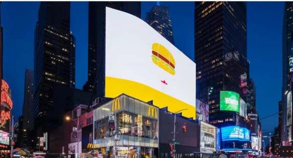
The project in New York Times Square aimed to create a more vibrant atmosphere for the day and a calmer, more intimate setting for the night, with the overall structure of the store design revolving around an open layout, padded benches and LED lighting. The ceiling was specifically raised to accommodate rows of magnetic linear track lights. Suspended white luminescent LED glass tubes and recessed COB downlights are distributed in the center and dining area. These three signature lighting fixtures add minimal yet sophisticated style and visual appeal to the entire 11,200-square-foot, three-story restaurant. Additional minimalist, decorative wall lamps echo the red wireframe dining chairs, while accenting the wide wood veneer panels.

Sydney International Airport's Terminal 1
The glowing yellow glass box has become a tourist attraction at Sydney International Airport's Terminal 1. Landini says the mission at this store was to create an iconic and memorable customer experience that is unlike anything people'll find in any airport terminal. Its solution was to combine an electronic ordering system, a kitchen on top of a stacked preparation platform and vertical transportation to create a unique spectacle. Rows of flexible LED strip lights highlight the top level of the structure, which appears to float above the concourse. Customers simply take in the view from their seats around the perimeter and wait for their food to be delivered on conveyor belts. It was an innovative challenge that exemplifies how McDonald's continues to push the boundaries of design.

From the architecture and interior design to the brand positioning, the design of logo, packaging, and staff uniform, to the store guide, Landini Associates overall planned and completely revamped the world's largest restaurant chain, which, according to Mark Landini, the creative director of Landini Associates, lighting is a key element in creating a minimalist environment that allows people to focus on the food, the service and the people who come to enjoy it. Seemingly subtle changes in lighting design add freshness to the experience that is classic and timeless. He also noted that lighting is just as equally important as shadows in the design and should be adjusted flexibly to the time of day and location. Getting the lighting right has always been one of their core design principles. As a whole, Project Ray is an excellent example of insights-based lighting design, starting with a rare but often iconic social state, then precisely fit the needs of the target audience with lighting design.
YOURLITE is a China OEM and wholesaler that has more than 26 years of business experience in the lighting field, integrating production, design, R&D, sales, service, and marketing. Thus Yourlite are capable of providing not only the best lighting fixtures but also the most professional lighting solutions in versatile fields such as architectural lighting, commercial lighting, new energy lighting, etc.
Media Contact
Company Name: Ningbo Yourlite Imp & Exp Co., Ltd
Email: Send Email
Country: China
Website: https://www.yourlite-lighting.com/


